Forum:Homepage ideas
I’ve been organising a lot of the topics into more sections lately, and I wondered if it would be possible to update the homepage with links to them?
I had to move some things around to fit them all in, though. Could we move the Turbine links into the gray translations box (colour coordinated gray with the Turbine trademarks box at the bottom)?
Also, I thought perhaps we could change 3 links from the popular topics box at the top taking the new skills and features into consideration.
- Change the Jewelry (6,995 views) link and icon to Contracts (10,563 views) instead.
- Change the Level Costs (15,404 views) link (not icon) to Skills (18,543 views) instead.
- Change the Dyeing (6,148 views) link and icon to Tailoring (7,805 views).
You can see the changes here.
Thoughts?
--Arkalor 09:05, 27 May 2012 (EST)
Well, if nothing else Gearcraft could probably be removed as a main topic since its been merged with item tink. That would clear a spot for tailoring in the crafting column.
Personally though, I'd like to see a lot of the clutter removed from the homepage. We have 25 main topic links, and at the bottom of the page there are 86 more topic links (including repeats of the main topics). Most, if not all, of these pages can be reached via the navigation menus. I'd like to go with something more like what I did on wikia. Have a few main topic links on the homepage (say, 12-15), and make sure those main topic pages have all the links a player needs.--An Adventurer 11:04, 27 May 2012 (EST)
I'm a very minimalist person by nature, so I like what you have done with the Wikia homepage.
When you say 12-15 main topics, do you mean like Crafting, Housing etc - and would they be icons (icons are cool =D ) or buttons?
I've sort of run out of things to do on the Wiki now so I don't mind updating links or articles if we do need to change anything again.
Thanks for replying.
--Arkalor 11:37, 27 May 2012 (EST)
I was thinking something like what I've set up on my sandbox page. This was a very rough draft, but I think with a few tweaks it could be pretty nice. The Examplar images are a little big, but they were the best thing available on the wiki for my purposes.
--An Adventurer 02:02, 28 May 2012 (EST)
I made some quick exemplar images for that page and I think that that looks pretty cool actually. Were those all the links you were thinking of then?, and how much much smaller were you thinking of for the images - 150px?. --Arkalor 06:10, 28 May 2012 (EST)
Well like I said, I was just using the examplar images as placeholders, since they are pretty close to what I'd use. The reasons why I wouldn't want to use them on the homepage is because they are too large, the text on them is not in an easily readable font, and the text is all over the place (top, center, and bottom aligned).
Ideally, I'd like to see 150-200px images with no text, and probably no filters ran on them (or at least not the examplar filter, because it obscures a lot of detail). From there we could play with the table properties to get them correctly aligned and such.
We want to keep in mind that some users will viewing in smaller resolutions (1024x768 and up). With the current homepage, you can see the entire list of popular topics at this lower res. With the new layout idea on my sandbox page, you can only see the first 3 images. Whatever design we go with, we'd want to be able to see most/all of the topics at 1024x768. --An Adventurer 22:37, 29 May 2012 (EST)
Ok, I've uploaded most of the images in my folder without the filter and font. Some of them aren't the greatest quality because I got bored and just started cropping teaser images and other images from my collection to save time hehe.
Not sure if you would be interested modifying any how you want but here they are anyway.
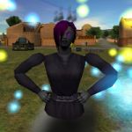

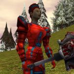
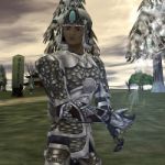


--Arkalor 23:58, 29 May 2012 (EST)


Sorry for coming to this discussion late, a few points: One of the more consistent criticisms I get about the wiki is it can be hard to find things so I don't believe redundancy in exposing ways to find things is a bad thing, also for a couple of reasons not everyone is able to use the navigation sidebars (javascript disabled, older browsers, touch based devices, noscript extension). Also the links at the bottom are on the main page for SEO reasons and to facilitate spider crawls in addition to being another content exposure surface (and as simple text links they add nothing to the main page load times, something larger images would add significantly to for people on slow connections). For returning or new players it also offers a bookshelf/browsing point where they can find things that they might never know to look for because they don't know they exist.
The way the brain processes visual data make images larger than at most about 64x64 icons create processing overhead that makes their use as navigation points difficult and stressful (this actually touches on one of my formal areas of training). Even more so if they are abstractions without text.
I think many of those images would be great on the actual pages/content portals, I don't believe they would be a good idea on the main page. Its primary purpose is navigation, quickly getting the reader to the content they want to read, looking good is great, but it shouldn't get in the way of the primary goal.
--How often to wash makeup brushes? ,<a href=http://cheap-macmakeupor.webs.com/#38275>wholesale mac makeup</a> ,,http://clarisonicmia2us.webs.com/#18392 00:54, 20 June 2012 (EST)
Just a heads up on your design Arkalor, it doesn't fit in 1024x768 (you are forced to side scroll), which IMO is the lowest resolution we should be designing for. Other than that, It looks good. --Atarax 07:43, 20 June 2012 (EST)